
UX Design Principles for Startup Websites and Apps
User expectations are higher than ever, and for startups, delivering a seamless app user experience can be the difference between success and failure. In a world where users have countless options, even the smallest design flaw can drive them to competitors.
Effective UX design for apps and websites is all about creating smooth, intuitive interactions that help users achieve their goals effortlessly. Startups need to prioritize usability and accessibility from the start to capture attention and build loyalty.
On the other hand, poorly designed interfaces can quickly land you on lists of apps with bad UX, damaging brand reputation and growth potential.
This guide will walk you through the core UX design principles essential for startup websites and mobile applications. Ready to dive in? Let’s explore what makes for great UX design mobile app experiences and why getting it right from the beginning is non-negotiable.
Core UX Design Principles for Startup Success

Whether developing a website or launching an app, great UX begins with clear principles. For startups, mastering these foundations ensures that your product attracts users and keeps them coming back.
Here’s a look at the essential principles that can make or break your product's success.
1. Simplicity Wins Every Time
In UX, less is more. Simplicity helps users focus on what’s important without feeling overwhelmed. The goal is to minimize cognitive load — that mental effort required to understand how your product works. If users get lost in unnecessary elements, they’ll leave.Best Practices for Simple UX Design:- Use clear, concise language in menus and buttons (e.g., 'Get Started' instead of 'Initiate Your Process').
- Limit the number of steps in forms and processes to avoid frustration.
- Apply whitespace generously to guide user attention and make screens less cluttered.
Example: Think of Google’s homepage — just a search bar and two buttons. Simple yet effective.Avoid This: Too many startups fall into the trap of trying to add every feature upfront. Instagram, for example, started with photo sharing only. Additional features like Stories were introduced later, ensuring the app user experience evolved smoothly without overwhelming early users.2. Consistency Across Platforms Builds Trust
Users who switch from your mobile app to your desktop site expect things to look familiar. Inconsistent design — like different icons or navigation structures — creates friction. Familiarity reduces the learning curve and builds trust, which is essential for startups trying to capture new audiences.Ways to Ensure Consistency:- Stick to a predefined design system, including fonts, color palettes, and button styles.
- Use the same UX patterns across platforms — if swiping right means 'like' in your app, the same action should apply to your product’s web version.
- Maintain a consistent tone in your messaging and CTAs (call-to-actions).
Example: Spotify’s UX feels seamless whether you’re using the app on a phone, tablet, or desktop. Users know where to find their playlists and how to navigate the player, no matter the platform.Tip: Even if your website and app look slightly different due to screen size, interactions (like button behavior) should feel the same everywhere.3. User-Centered Design is Non-Negotiable
Your product must revolve around user needs, not your preferences. User-centered design (UCD) starts by researching what users want and crafting a solution that aligns with those needs. If you ignore this principle, you risk building features no one uses.Steps to Apply UCD Effectively:- Conduct usability tests regularly and collect feedback directly from users.
- Build user personas to understand who your audience is and what challenges they face.
- Map the user journey, identify pain points at every stage, and refine solutions to eliminate them.
Example: Slack’s user-centered design helps startups improve team communication by focusing on features that simplify collaboration. Instead of forcing new users to figure out complicated workflows, Slack’s design offers intuitive onboarding with tooltips and friendly instructions.Pitfall to Avoid: Without user research, your app may end up like many apps with bad UX, where developers assumed features would work—only to find they didn’t resonate with users.4. Mobile-First Thinking is Key to Winning Users
With mobile devices accounting for over 50% of global web traffic, startups must adopt a mobile-first approach. This means designing for smaller screens first, then scaling up to larger devices like tablets or desktops.Benefits of Mobile-First UX:- Faster load times, which reduces bounce rates.
- Layouts optimized for touch gestures — think swipe, pinch, and drag.
- Better accessibility on the go, improving retention for mobile users.
Tip: Use thumb-friendly zones to make navigation easier. Buttons and key elements should be within reach for one-handed use. Users won’t stick around if they struggle to interact with the interface on a small screen.Example: TikTok nailed the UX design mobile app approach with a layout that’s perfectly tailored for vertical scrolling. Each interaction — liking, commenting, or sharing — is easily accessible, creating an addictive, intuitive experience.5. Accessibility Equals Usability for Everyone
Accessibility is a requirement. Designing for inclusivity means your product will work for everyone, regardless of disabilities. This expands your audience and helps you comply with standards like the Web Content Accessibility Guidelines (WCAG).How to Improve Accessibility:- Use alt text for images, making your product usable for screen readers.
- Offer high-contrast color options for users with visual impairments.
- Ensure your interface supports keyboard navigation and voice commands.
Example: Microsoft’s Xbox adaptive controller is an example of accessibility done right, giving users with disabilities the same seamless gaming experience. Similarly, incorporating accessibility features enhances your UX design application by removing barriers for all users.6. Feedback Loops Create Continuous Improvement
A product is never truly finished. User behavior evolves, and so should your design. Regular feedback loops help you stay aligned with user expectations. This applies to both UX design for apps and websites — keeping your product relevant and user-friendly over time.How to Build Feedback into Your Process:- Include simple surveys or pop-ups asking users for feedback.
- Monitor analytics tools to identify points where users drop off.
- Run A/B tests to see which design changes improve performance.
Pro Tip: Encourage beta users to share insights early in development. This ensures any design flaws are caught before the public release.Example: WhatsApp frequently rolls out updates based on user feedback. This iterative approach ensures the app user experience stays fresh, relevant, and valuable.UX Design for Mobile Apps vs. Websites – Key Differences
Creating great UX design for apps and websites isn’t a one-size-fits-all approach. Although they serve similar purposes, mobile apps and websites engage users differently.
1. Interaction Patterns and User Behavior
On mobile apps, users interact primarily through touch gestures — like tapping, swiping, pinching, and long-pressing. In contrast, websites are navigated via clicks, scrolling, and typing on a keyboard or mouse, offering different interaction opportunities. Additionally, mobile users often engage in short, frequent sessions while on the move, whereas website interactions involve longer, task-focused sessions.How to Adapt:- Apps: Implement gesture-based shortcuts (e.g., swiping to delete emails). Use haptic feedback to provide instant confirmation for user actions.
- Websites: Focus on clear click-based interactions. Provide navigation breadcrumbs to help users track their journey.
Example: Tinder’s swipe-right functionality became iconic for UX design mobile app users, creating an intuitive gesture that’s impossible to replicate the same way on a desktop.2. Screen Size and Layout Constraints
 Mobile apps deal with much smaller screen real estate, requiring a minimalist approach with prioritized content. Websites, however, have the luxury of using larger layouts with sidebars, grids, and multiple visual elements. This affects both how content is displayed and how users interact with it.Design Tips:
- Apps: To maximize space, use collapsible menus and floating action buttons (FABs). Keep forms short and use auto-fill options.
- Websites: Include more complex elements like mega-menus and expanded CTAs. Use hover effects for additional functionality that wouldn’t work on touch devices.
Example: Airbnb’s mobile app reduces clutter by using bottom navigation, while its website features multiple search filters prominently on the homepage.3. Performance Expectations and Load Times
Mobile users have higher expectations for speed and responsiveness. A slight lag or delay in a mobile app can lead to uninstalls, whereas website users are a bit more forgiving — but only to an extent. Performance is one of the biggest factors in the app user experience and can directly impact retention.Optimization Strategies:- Apps: Minimize background processes and optimize load times through preloading content.
- Websites: Use lazy loading and content delivery networks (CDNs) to improve page speed. Compress images and minify CSS/JavaScript files.
Stat to Remember: 53% of users abandon a mobile site if it takes longer than 3 seconds to load.4. Connectivity and Offline Access
Mobile apps offer offline functionality, allowing users to engage with key features even without an internet connection. Websites, however, are heavily reliant on real-time connectivity—although caching can help with limited offline access.How to Adapt:- Apps: Store critical data locally, allowing users to perform tasks offline. Provide auto-syncing once the connection is restored.
- Websites: Use Progressive Web App (PWA) technology to enable some offline functionality, such as viewing previously visited pages.
Example: Google Maps lets users download maps to use offline, while the web version only offers limited cached views without live data.5. Updates and Maintenance
Updating mobile apps requires users to download new versions through app stores, meaning developers must plan carefully to ensure seamless updates. On the other hand, websites can be updated instantly, with changes visible the moment they are deployed.Best Practices:- Apps: Use staged rollouts to test updates with a small group of users before full deployment. Include changelogs in app stores to communicate what’s new.
- Websites: Continuously make incremental changes and run A/B tests to see what works best without disrupting the user experience.
Example: WhatsApp uses beta versions to test new features, ensuring only polished updates reach the wider audience. Websites like Netflix update their UX frequently without requiring user intervention.6. User Sessions and Engagement Strategies
Mobile apps are designed for frequent, bite-sized daily interactions, using notifications and gamified features to re-engage users. On the other hand, websites are built for longer, more in-depth sessions, often focused on research, shopping, or learning.Engagement Tactics:- Apps: Utilize push notifications to bring users back. Add gamification elements like streaks or progress bars to maintain engagement.
- Websites: Implement email reminders, chatbots, and personalized recommendations to keep users on the site longer.
Example: Duolingo uses push notifications to remind users to complete lessons, while the desktop version offers more detailed explanations and resources.7. Security and Permissions
Both platforms need robust security measures, but mobile apps often require access to device-specific features — like location, contacts, or camera — which makes users more cautious about privacy. Websites must also secure user data, especially for e-commerce or financial transactions.Security Considerations:- Apps: Explain why permissions are required to build trust with users. Implement biometric logins (like Face ID) for added security.
- Websites: Use SSL certificates, implement two-factor authentication (2FA), and follow GDPR or CCPA data privacy guidelines.
Example: Banking apps like Chase use biometric authentication to enhance security, while the web version offers 2FA to secure logins.8. Platform-Specific Design Guidelines
Each platform comes with its design guidelines and constraints. This means following the standards for apps set by iOS and Android platforms. Websites, on the other hand, need to be compatible with multiple browsers, including Chrome, Firefox, and Safari.Design Tips:- Apps: Stick to platform-specific design systems like Apple’s Human Interface Guidelines and Google’s Material Design.
- Websites: Ensure cross-browser compatibility and use responsive design to adapt to different screen sizes.
Example: Instagram’s Android and iOS apps feel native to each platform, adhering to each system’s design rules. Their web version, however, offers a more simplified experience optimized for desktop browsing.How to Avoid Common UX Mistakes in App and Website Design
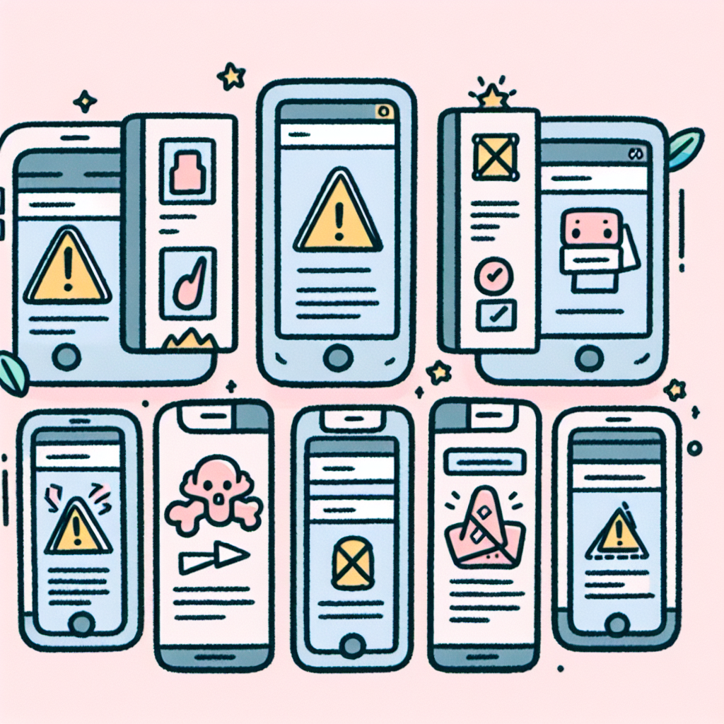
Even the most well-intentioned designs can go off track, leading to poor user experiences. Let's explore some of the most common UX mistakes and how startups can avoid them to prevent their products from becoming apps with bad UX.
1. Overcomplicating Navigation
A confusing navigation structure is one of the fastest ways to frustrate users. If they can’t figure out how to get from Point A to Point B, they’ll leave — simple as that.How to Avoid:- Use familiar navigation patterns, like bottom nav bars for apps and sticky headers for websites.
- Limit menu options to essential functions. Don’t overwhelm users with too many choices.
- Provide a search feature to help users quickly find what they need.
Example: Many apps with bad UX overload users with nested menus. In contrast, apps like Uber keep navigation minimal — just a few buttons to request a ride, see your trips, and adjust settings.2. Ignoring Mobile Optimization for Websites
In a mobile-first world, failing to optimize your website for smartphones is a cardinal sin. Users expect responsive websites that load quickly and function smoothly on any screen size.How to Avoid:- Test your website’s mobile responsiveness across various devices.
- Prioritize mobile-friendly elements like large, easy-to-tap buttons and readable fonts.
- Minimize loading times by compressing images and using optimized code.
Pro Tip: Google rewards mobile-friendly websites with higher rankings, making mobile optimization crucial for SEO.3. Poor Performance and Long Load Times
A slow app or website is an instant dealbreaker. Users are quick to abandon platforms that don’t load fast enough, and even a one-second delay in load time can lead to a noticeable drop in engagement.How to Avoid:- For apps: Optimize code, reduce the number of API calls, and use lightweight graphics.
- For websites: Enable browser caching, minify JavaScript and CSS, and implement lazy loading.
Example: Amazon’s success is partly due to its obsession with speed. Every millisecond matters, ensuring users never feel frustrated by delays.4. Cluttered Interfaces and Too Many Features
Packing too many features into a product can overwhelm users and lead to decision fatigue. Startups often fall into the trap of adding everything at once, thinking it will improve the product.How to Avoid:- Launch with a minimal viable product (MVP) that offers just enough features to solve a core problem.
- Gradually introduce new features based on user feedback.
- Keep interfaces clean with whitespace and only show relevant information.
Example: WhatsApp started as a simple messaging app before gradually adding voice calls, video calls, and status updates — keeping the experience smooth at every step.5. Inconsistent Design Elements
Inconsistent fonts, colors, or button styles create a disjointed experience that can confuse users. Consistency is key to building familiarity and trust.How to Avoid:- Use a design system that defines fonts, colors, icons, and buttons to ensure consistency.
- Regularly audit your product to catch inconsistencies and fix them.
- Make sure your app and website follow a unified design language, even if they have slightly different layouts.
6. Skipping User Testing and Feedback Loops
Some startups skip usability testing, assuming their product is perfect from the start. This often leads to frustrating experiences that could have been avoided with early feedback.How to Avoid:- Conduct user testing at different stages of development to catch issues early.
- Use A/B testing to compare design changes and see what works best.
- Actively collect user feedback post-launch and continuously iterate.
Example: Instagram’s feature updates are often based on user feedback, ensuring that the platform stays relevant and user-friendly.7. Ignoring Accessibility Needs
Designing without considering accessibility limits your audience and can hurt your brand’s reputation.How to Avoid:- Follow accessibility guidelines (e.g., WCAG) to ensure your app and website work for everyone.
- Add alt text for images, ensure color contrast, and use readable fonts.
- Provide text-to-speech options or screen reader compatibility.
Example: Apple’s iOS platform is known for its strong commitment to accessibility, which enhances the app user experience for everyone.8. Lack of Clear Call-to-Actions (CTAs)
A well-designed product guides users toward a goal, whether that’s making a purchase, signing up, or completing a task. Vague CTAs leave users unsure of what to do next.How to Avoid:- Use action-oriented language for CTAs (e.g., “Sign Up Now” or “Start Your Free Trial”).
- Make CTAs stand out with contrasting colors and clear placement.
- Limit the number of CTAs per screen to avoid overwhelming users.
Example: Netflix’s landing page features a single, clear CTA: “Join Now.” It’s impossible to miss and encourages users to take action immediately.9. Poor Onboarding Experience
If users feel lost within the first few minutes of using your product, they’re unlikely to stick around. A smooth onboarding experience helps users understand how to get value from your app or website quickly.How to Avoid:- Use tooltips and walkthroughs to introduce key features step-by-step.
- Offer a skip option for users who prefer to explore on their own.
- Provide a progress indicator during onboarding to set expectations.
Example: Duolingo offers a friendly, gamified onboarding that familiarizes users with the app in minutes, increasing retention rates.10. Neglecting Analytics and Data-Driven Improvements
 Launching your app or website isn’t the end—it’s just the beginning. You won’t know what’s working and needs improvement without tracking user behavior and performance metrics.How to Avoid:
- Set up analytics tools to monitor user interactions and identify drop-off points.
- Use heatmaps to see where users click and scroll most frequently.
- Continuously iterate based on data insights to enhance the UX design application over time.
By avoiding these pitfalls, startups can stay ahead of the curve and deliver exceptional app user experience and web experiences. Remember, users have little patience for clunky designs or performance issues, and getting UX right can be the difference between success and failure.Elevate Your UX with Aurora Insights
Getting UX design right for your startup’s website or app is essential. From intuitive navigation to seamless performance and user-centered design, every detail matters in delivering a great experience. And let’s face it — no one wants their product associated with apps with bad UX.
Whether crafting a sleek website or developing the next big thing in mobile apps, maintaining a strong focus on UX will help you build trust, retain users, and grow your brand. But great UX doesn’t happen accidentally — it requires data, insight, and continuous refinement.
That’s where Aurora Insights comes in. We help startups design and optimize user experiences that make an impact from day one. With our data-driven approach and industry expertise, we’ll guide you through every step of the UX design journey — from research to launch and beyond.
Don’t leave your user experience to chance — partner with Aurora Insights to build something users will love.
Ready to elevate your UX? Let’s make it happen.
