
Mobile-First Design: Why It Matters for Your Startup
In today’s world, your startup's website is the front door to your entire brand. And more often than not, that front door is opened on a mobile phone.
Imagine this: you’ve got a potential customer eager to check out your site, but when they try on their phone, it’s slow, clunky, and hard to navigate. You’ve lost them before you even had a chance to show them what it is you can offer. This is where mobile-first design comes in — and why it’s an absolute game-changer for startups like yours.
We live in a mobile-dominant age. Over 60% of global web traffic now comes from mobile devices, and that number isn't slowing down anytime soon. If you’re not designing with these users in mind first, you’re missing out — big time!
The mobile first approach ensures your website is tailored for those on-the-go users, making it smooth, fast, and easy to use. It’s all about making sure your visitors have the best experience possible, no matter what device they’re on.
The beauty of the mobile first web development strategy is that by focusing on mobile, you’re forced to prioritize what’s really important. You cut out the fluff and keep what matters most to your customers, giving them a streamlined, enjoyable experience from the get-go.
Here’s a closer look at why this strategy can make — or break your brand.
What is Mobile-First Web Design?
So, what exactly is mobile-first web design, and why should you care?
In a nutshell, it’s all about designing your website starting from the smallest screen — usually a smartphone — and working your way up. Instead of creating a desktop site and then trying to make it "fit" on a phone, you flip the process. You build for mobile users first and then expand the design for bigger screens like tablets and desktops.
Now, why does this matter to you as a startup?
Well, designing for mobile first means you’re laser-focused on simplicity. There’s no room for distractions or unnecessary features. You’re giving your users exactly what they need, right when they need it. Think of it like this: when someone lands on your site via their phone, they’re usually looking for quick, easy-to-find information. Whether it's a contact form, product details, or a booking button, you need to make sure it’s front and center.
By embracing mobile first responsive design, you're ensuring that your website is not only optimized for mobile but is also scalable and adaptable to larger screens. This approach naturally improves the user experience for everyone, making sure your startup’s digital presence is both flexible and future-proof.
The Benefits of Mobile-First Development for Startups
As a startup, embracing a mobile first development strategy is crucial to your success. In a world where users are increasingly engaging with brands through their mobile devices, this approach offers numerous advantages that can set your startup apart.
Some key benefits of focusing on mobile-first include:
1. Enhanced User Experience (UX)
 When was the last time you visited a website on your phone and couldn’t figure out how to navigate it? Frustrating, right?The same applies to your users. The mobile first approach ensures that your website is optimized for the device most people use — smartphones. By designing for mobile first, you’re creating a smooth, easy-to-use interface that users love.Here’s the key: mobile users are often on the go, seeking quick, seamless experiences. They’re not interested in flashy design elements that slow down the experience or make it confusing. They want information fast, whether it’s contact details, product features, or a booking form. A mobile first responsive design guarantees that your site prioritizes what’s most important for mobile users, delivering the essentials with clarity and speed.An optimized mobile user experience has a direct impact on customer satisfaction and engagement. If users find your site easy to navigate, they’re more likely to stay longer, explore further, and — most importantly — convert into customers. It’s all about meeting their needs where they are, and where they are is on their mobile devices.
2. Improved SEO and Search Visibility
 Another huge benefit of adopting mobile first web design is how it impacts your SEO strategy. Google now uses mobile-first indexing, meaning it primarily looks at the mobile version of your site when determining search rankings. If your mobile site is slow or poorly optimized, it can negatively affect your ranking in search engine results, which means fewer people will find your startup online.When you design with mobile first web development, you’re naturally ensuring that your site meets Google’s standards for mobile usability. This not only makes your site more user-friendly but also boosts your chances of ranking higher in search results, making it easier for potential customers to discover your brand.Moreover, mobile-optimized websites tend to have faster load times — another critical factor Google considers when ranking websites. If your mobile site is fast and easy to use, you’ll see improvements in your site’s SEO performance, driving more organic traffic and ultimately leading to more conversions.Imagine the potential impact: when your startup ranks higher on Google, your visibility skyrockets, bringing in more visitors. And because your mobile first web design ensures that visitors have a great experience on their phones, they’re more likely to stick around and engage with your brand. It’s a win-win for both search engines and your users.
3. Faster Load Times and Better Performance
Speed matters, especially on mobile. A key aspect of mobile first development is creating a site that loads quickly and performs efficiently on smartphones. Research shows that if a site takes longer than three seconds to load, most users will abandon it. For your startup, that’s a lot of lost opportunities!A mobile first approach inherently promotes a cleaner, more streamlined design. Since mobile screens are smaller, you’re forced to focus on what’s truly important, minimalist layouts, optimized images, and fewer heavy elements that can slow down your site. As a result, your site becomes much faster, especially for users on mobile data connections, which often aren’t as fast as desktop internet.Faster load times have several benefits. First, users are more likely to stay on your site when it loads quickly, reducing your bounce rate. Second, faster load times are directly linked to better SEO, since Google prioritizes mobile sites that perform well. And finally, a fast, efficient mobile site makes for a more enjoyable user experience, increasing the likelihood that visitors will convert into customers.In short, fast performance isn’t just a nice-to-have; it’s a must. By focusing on mobile first web development, you’re building a site that performs at its best, ensuring that your startup makes a great first impression — every time.4. Scalability and Future-Proofing Your Website
One of the biggest advantages of designing a mobile website first is that it sets your site up for scalability. As new devices, screen sizes, and technologies emerge, your website will be better equipped to adapt. Since mobile-first design starts with the smallest screen, it’s much easier to scale up for larger screens like tablets, desktops, or even future tech like foldable devices.By beginning with a mobile first responsive design, you create a foundation that allows for easy growth and expansion. This approach ensures your website is flexible and can adjust to different screen sizes without breaking the user experience. This is especially important as mobile technology continues to evolve rapidly. New devices with different aspect ratios and screen sizes are constantly entering the market, and a mobile first approach ensures that your website is prepared to handle these changes.For startups, this flexibility is a huge advantage. Instead of constantly redesigning your site every time a new device hits the market, a mobile-first design allows your site to adapt seamlessly, saving you time and resources in the long run. It’s an investment in the future that ensures your site is ready for whatever comes next.5. Better Conversion Rates
At the end of the day, your startup’s website has one primary goal: to convert visitors into customers. A mobile first web design directly contributes to higher conversion rates by providing a streamlined, distraction-free experience for mobile users. When visitors can easily navigate your site, find the information they need, and complete key actions like purchasing a product or signing up for a service, they’re far more likely to convert.Consider the typical mobile user journey: they arrive on your site looking for something specific, such as product details or a way to contact you. If your site is optimized for mobile, they’ll quickly find what they need, and the clear, simple interface will guide them towards completing the desired action — whether that’s making a purchase, filling out a form, or signing up for a newsletter.Moreover, features like large, easy-to-click buttons, clear call-to-actions, and fast load times all contribute to a better user experience, which leads to higher conversion rates. A mobile first approach makes it easier for your visitors to take the next step, whether they’re on a phone, tablet, or desktop.For startups, every conversion counts, and a well-designed mobile site can make all the difference. By focusing on mobile first web development, you’re setting up your website to guide users smoothly through the conversion funnel, ultimately increasing sales and growing your business.Why Mobile-First is Critical for Startups in 2024
As a startup in 2024, the stakes are higher than ever. Competition in the digital space is fierce, and having a cutting-edge website is essential.
The reality is that mobile usage dominates the web today. With over 60% of web traffic coming from mobile devices, mobile first web development is the bare minimum you need to stay relevant. If your site isn’t designed to work flawlessly on mobile devices, you're actively losing business
Mobile Traffic is Dominating
Mobile traffic has steadily increased over the years. Studies show that mobile browsing outpaces desktop browsing globally. In some industries, the gap is even wider, with as much as 80% of traffic coming from mobile users. Startups, especially those targeting younger, tech-savvy audiences, need to recognize this shift.For instance, eCommerce businesses see a significant portion of sales happening through mobile apps or websites. If your startup involves selling products or services online, a poor mobile experience could be costing you thousands in lost sales each year. Adopting a mobile first approach means meeting your users where they are — on their phones.Google’s Mobile-First Indexing is Here to Stay
Google’s switch to mobile first indexing is a crucial factor for startups to consider. This means Google primarily uses the mobile version of your website for indexing and ranking. Essentially, if your mobile site isn’t up to par, your search rankings — and consequently, your visibility — will suffer.Startups, which often rely heavily on organic traffic, can’t afford to ignore this. SEO is a long-term game, and optimizing for mobile from day one ensures that you’re on the right track to climbing the search rankings. By embracing mobile first web design, you’re effectively staying ahead of competition.Changing User Behavior
The way people browse the web has changed dramatically over the past decade. People no longer sit at a desktop to explore products or services; instead, they’re using their phones while commuting, waiting in line, or during short breaks in their day. These short interactions mean users want fast, easy-to-navigate experiences on their phones. Your startup must be designed to accommodate this.A mobile first responsive design takes into account these behavioral shifts. It creates streamlined experiences that are intuitive and responsive to the user’s needs, keeping them engaged and increasing the likelihood of conversion. Today’s users expect an app-like experience when browsing on mobile, and mobile first development helps you deliver that.Common Challenges in Adopting a Mobile-First Approach
While the mobile first approach has clear advantages, it’s not without its challenges, especially for startups that may have limited resources.
Let’s look at some common hurdles and how you can overcome them.
Resource Constraints
Startups often face budget constraints that can make investing in mobile first web development seem daunting. Hiring experienced developers, testing across multiple devices, and ensuring your site is both functional and fast on mobile can require significant investmentSolution: Prioritize the basics. Start by focusing on core mobile functionalities like load times, navigation, and clear call-to-actions. You can always scale up and refine the design as your startup grows.Balancing Mobile Simplicity with Functionality
A major challenge with mobile first design is balancing simplicity with functionality. Mobile screens are small, which means you need to strip away unnecessary elements. However, this can sometimes lead to a lack of features that users expect.Solution: Focus on a minimalist design without sacrificing usability. Use collapsible menus, streamline your content, and prioritize features that are essential to your users. Conduct user testing to identify what works and what doesn’t.Testing Across Devices
The wide variety of mobile devices — from different screen sizes to varying operating systems — can make testing a headache. What works on an iPhone may not work the same way on an Android device.Solution: Use responsive design frameworks like Bootstrap or Foundation to create adaptive layouts. Additionally, leverage mobile device emulators and testing platforms to ensure your site works seamlessly across all devices and browsers.Best Practices for Mobile-First Web Design
To make the most of mobile first development, it’s essential to follow industry best practices. These guidelines will ensure that your website not only looks good but functions well across all devices.
Prioritize Speed
Speed is crucial for mobile users. Studies show that a delay of even one second can reduce mobile conversions by up to 20%. Ensure your website is optimized for fast load times by compressing images, minifying code, and using a content delivery network (CDN).Tip: Tools like Google’s PageSpeed Insights can help you identify areas where your site can be improved for faster performance.Optimize for Touch
Mobile users navigate with their fingers, not a mouse. Make sure that buttons, links, and forms are designed with touch in mind. Use large buttons that are easy to tap, ensure forms are simple to fill out on a small screen, and avoid hover-based interactions, which don’t work well on mobile devices.Tip: Keep clickable elements at least 48px by 48px to accommodate for touch gestures.Use Responsive Typography
Text should be readable without users having to zoom in. Ensure your fonts are large enough for mobile screens, typically starting around 16px for body text. Responsive typography allows your text size to adapt based on the user’s screen size, ensuring readability across all devices.Tip: Consider using flexible units like "em" or "rem" instead of fixed pixel sizes for text.Simplify Navigation
Since mobile screens have limited space, it’s important to keep your navigation simple. Use drop-down menus, hamburger icons, and concise labeling. Make sure users can easily find key sections of your website without having to scroll endlessly.Tip: Sticky navigation bars can be a great way to make sure users can access the main sections of your site without needing to scroll back to the top.Mobile-First and Accessibility: Designing for All Users
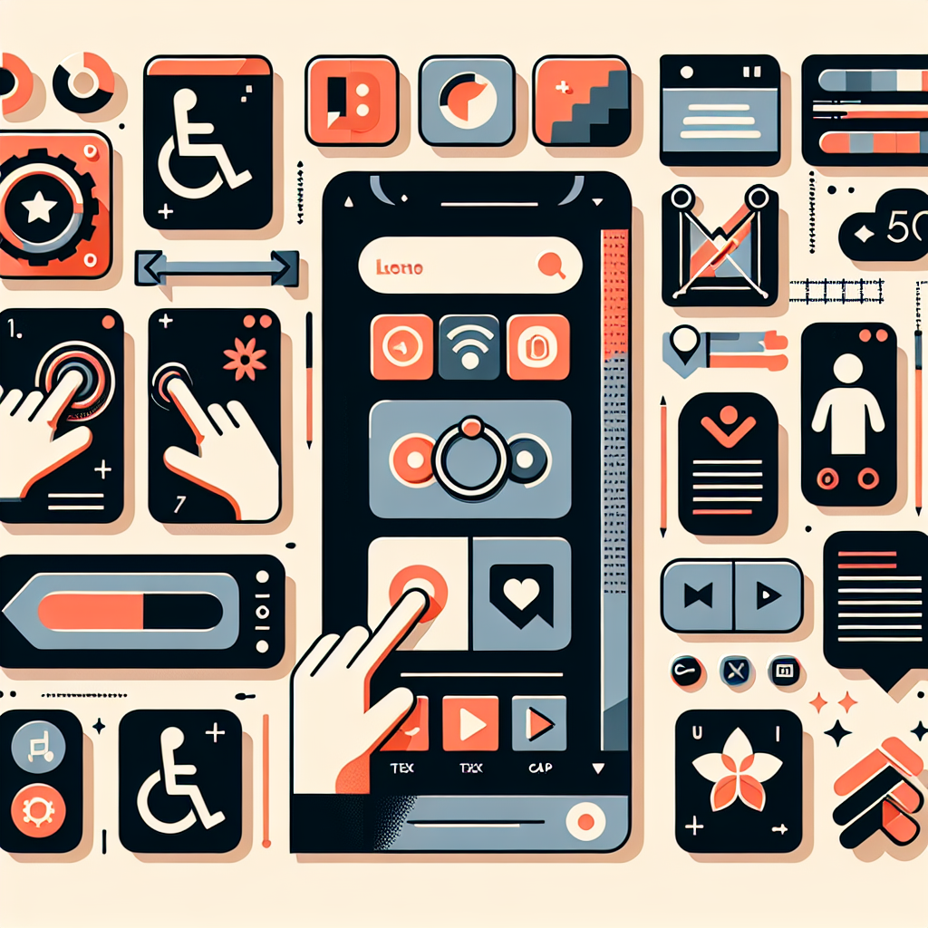
When we think of mobile first web development, we often focus on speed, user experience, and SEO, but an equally important aspect is accessibility. Ensuring that your website is accessible to all users — including those with disabilities — is not only the right thing to do but also a key factor in creating a user-friendly site that complies with legal requirements, such as the Americans with Disabilities Act (ADA).
Why Accessibility Matters in Mobile-First Design
In today’s inclusive world, accessibility is more important than ever. As a startup, you should aim to make your website usable by everyone, regardless of their abilities. This includes people who are visually impaired, have mobility challenges, or are hard of hearing. Accessible design is not just a moral imperative; it can expand your user base and enhance the overall user experience.According to the World Health Organization, over 1 billion people, or 15% of the global population, live with some form of disability. For these users, a poorly designed mobile site can present barriers that prevent them from engaging with your business. A mobile first approach can significantly reduce these barriers by prioritizing simplicity and ease of use.Key Accessibility Features for Mobile-First Websites
 Let’s look at a few best practices for making your mobile first web design accessible to all:
Text and Contrast
Ensure that text on your mobile site is large enough to read without zooming in and that there’s sufficient contrast between the text and background. Many users, particularly those with visual impairments, rely on strong contrast to easily read text.
Screen Reader Compatibility
A mobile first responsive design should be compatible with screen readers, which assist users who are visually impaired. This means ensuring all images have descriptive alternative text (alt tags) and that your site’s structure is easy to navigate with assistive technologies.
Keyboard Navigation
Some users cannot use a touchscreen or mouse and rely on keyboard navigation. Ensure that your mobile-first site allows for keyboard-based navigation, especially for key features like form fields, buttons, and menus.
Voice Commands and Accessibility Tools
As voice assistants like Siri and Google Assistant become more integrated into mobile devices, designing for voice command usability is a growing consideration. Ensure your website’s navigation is straightforward and logical, which makes it easier for users who rely on voice commands or other assistive technologies to interact with your site.
Mobile Accessibility Testing Tools
Testing your website’s accessibility is crucial to ensure it meets the needs of all users. There are several tools available that can help evaluate your site’s accessibility features:WAVE (Web Accessibility Evaluation Tool)
This tool highlights accessibility errors on your site and provides feedback on how to improve it for users with disabilities.
Lighthouse
A Google Chrome extension that helps evaluate a website’s accessibility, performance, and SEO, specifically focusing on mobile-friendly design.
Axe Accessibility Checker
This tool is a browser extension that automatically scans for and highlights accessibility issues within your website’s code.
The Benefits of Accessibility for Startups
Making your website accessible doesn’t just benefit users with disabilities — it can also have a positive impact on your business.Here’s how:Improved SEO
Many accessibility features, like providing alt text for images and proper site structure, also benefit SEO. By making your site accessible, you’re likely improving your search engine rankings as well.
Larger Audience
When your site is accessible, you’re opening your business to a larger audience. Millions of users worldwide rely on assistive technology, and by catering to them, you can tap into this often-overlooked customer base.
Legal Compliance
In many countries, including the United States and the European Union, there are laws requiring websites to be accessible to all users. By focusing on mobile first web development that includes accessibility features, you can ensure that your startup complies with these legal requirements and avoids potential lawsuits or fines.
The Mobile-First Future of Your Startup
As we’ve explored, mobile first web design is no longer just an option — it’s a must-have for startups aiming to succeed in today’s competitive digital landscape. With mobile traffic outpacing desktop use, and Google’s mobile-first indexing driving search rankings, the future is mobile, and your website needs to reflect that shift.By adopting a mobile first development strategy, you’re not only creating a better user experience for your visitors but also positioning your business to rank higher in search engines, perform faster, and adapt to new technologies as they emerge. From reducing bounce rates and increasing conversion rates to future-proofing your site, the benefits of going mobile-first are clear. It’s an investment in your startup’s long-term success.Moreover, incorporating accessibility into your mobile first web design allows you to tap into a broader audience, ensuring that your site is inclusive, user-friendly, and compliant with legal standards. In a world where user expectations continue to rise, prioritizing mobile performance and accessibility isn’t just good practice — it’s the key to building a sustainable, scalable business.And when it comes to building the perfect website for your startup, Aurora Insights is here to help. We specialize in creating websites that are optimized for mobile, fast, user-friendly, and built with future growth in mind. Whether you’re just starting out or scaling your business, Aurora Insights partners with you to craft a mobile-first site that puts your users first and sets your startup up for long-term success.The mobile-first future is here — make sure your startup is ready to thrive in it.
